How To Use the Relative “rem” Font Size Unit for Responsive Web Design Media Queries?
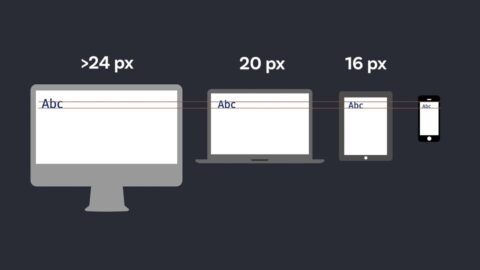
In today's mobile-dominant world, websites need to be as adaptable as a yoga master – effortlessly adjusting to any screen size. Responsive web design (RWD) is the key to achieving…
Continue Readingposted by Emad Zedan on 09 Jun 2024 in Coding,Design,Development,UX/UI Design,Web Design,WordPress